This infographic is based on a paper I wrote about libraries orienting more to place as a response to the climate crisis, demands for racial justice, and the global health pandemic.
Design decisions
I have created infographics in the past, but I focused mostly on arranging blocks of text over a background image, and created them without knowledge of concepts such as color theory, preattentive processing, and chartjunk. For this translation assignment, I followed the “Steps to Creating an Infographic” in the VISME guide (n.d., p. 27-100). My manuscript does not include dates, statistics, or charts, so following the flowchart on p. 42 in the VISME guide, I decided to create an informational/list infographic. Per VISME recommendations, I chose dimensions of 800 by 1600 pixels, as this size is appropriate for displaying on the web (p. 31). I am unlikely to share the infographic in person, as the members of my audience—academic librarians in the Pacific Northwest—are distributed across an area of hundreds of miles.
The discussion in Lankow, Ritchie and Crooks (2012) about visual storytelling guided my design choices. In the debate between “neutral,” explorative portrayals of data, and narrative editorializing (p. 36), an infographic translating my full manuscript would fall on the narrative side, as my objective in the paper is to lead readers to conclude that their libraries should orient toward place-based learning as part of long-term preparation for societal collapse. However, I decided to focus the infographic more narrowly than the paper, leaving aside the discussion of collapse theories and the future. My objective with the translation is to present information about what place-based learning looks like in libraries. I am wary of making too strong of an argument in favor of this approach, as my audience of information professionals needs to decide for themselves to implement this approach. By keeping the infographic more explorative in this way, my intention is to invite the audience to make their own conclusions. But I still am seeking to share the narrative that it is important for libraries to consider adopting a place-based orientation. My objective therefore falls in between the narrative, “commercial” infographics that seek to appeal first and foremost (p. 39), and those that prioritize comprehension and retention before appeal (p. 38).
I used an iterative approach to develop the visual theme and color scheme. My target audience is academic librarians in the Pacific Northwest, so a professional tone and mood was important. Lankow, Ritchie and Crooks (2012), citing Ware, explain that color is a preattentive attribute that our brains can process without any active attention. Using this knowledge, I grounded the color palette in nature and earth tones commonly used to represent the region (as in the Cascadia flag and the logos of the Seattle Seahawks and Starbucks). I selected shades of brown and contrasted these with blue-green shades, with pure white as the accent color. I chose serif fonts for the title and headings, and a sans serif font for body text.
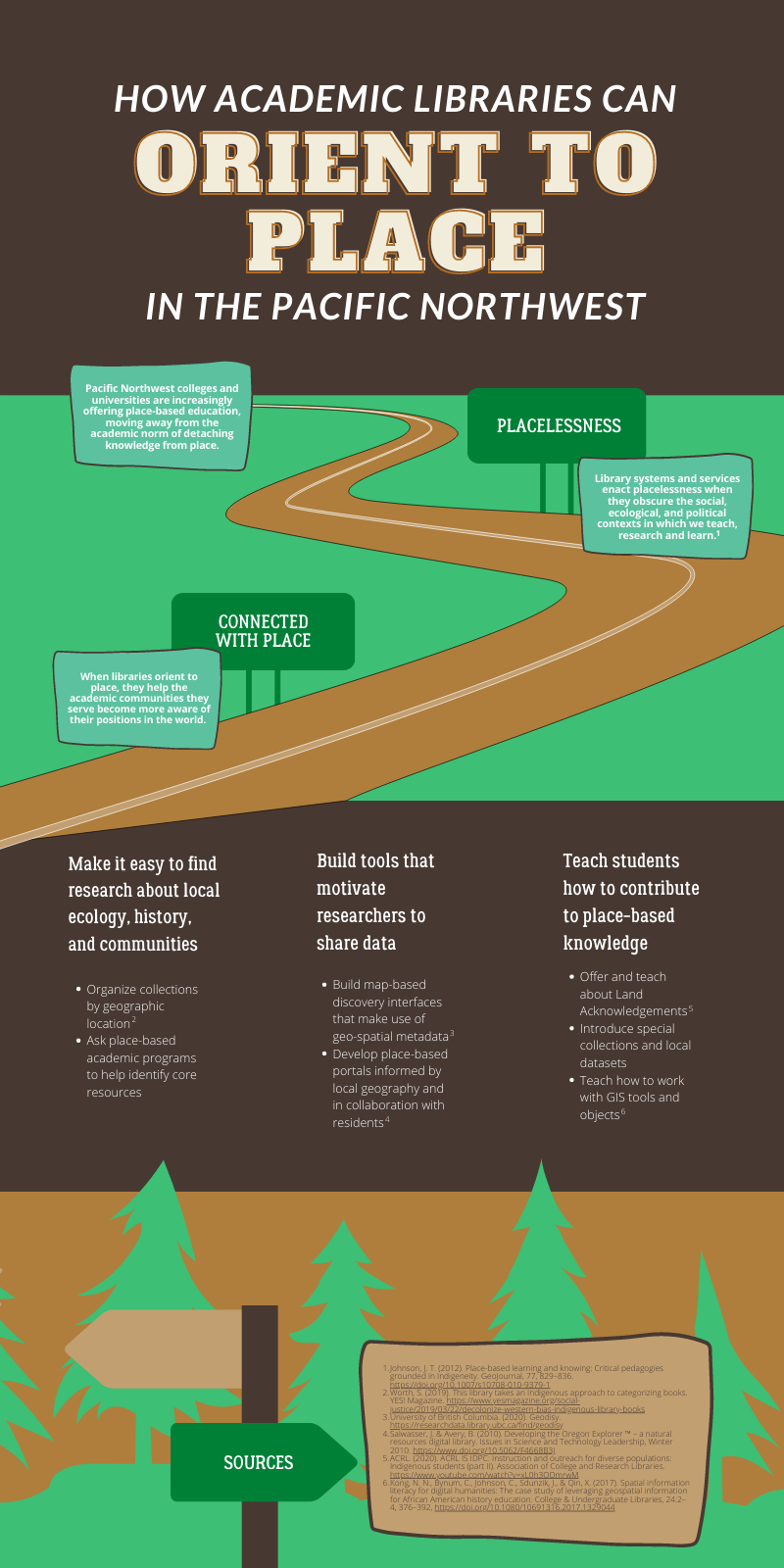
The main elements in my informational infographic are headings and body text. I considered accompanying each section of text with an icon. Tufte’s arguments against “chartjunk” (Lankow, Ritchie & Crooks, p. 35) kept me from doing this; the elements I considered would not communicate specific information and would distract viewers from reading the words. The statement in VISME that in informational infographics, “the words drive the message home” (p. 15), reinforced this decision for me. I decided to follow the suggestion on p. 65 of the VISME guide to use icons in the background, and went through a few iterations before landing on an approach that I felt communicated a metaphor without disrupting the visual hierarchy. Initially I thought about using an icon based on a map, such as an outline of the shorelines of the Northwest to represent the greater region. Lankow, Ritchie and Crooks state that symbols and icons can provide shortcuts, but only if they are universally understood by the audience (p. 52). While an outline of the shoreline might be interesting, it would require some study before making sense, and therefore would not be a visual shortcut. Individual outlines of the states of Washington and Oregon would be more recognizable, but I did not want to suggest that geo-political boundaries are representative of the region, as place goes beyond geo-political definitions. I decided to use a road as a visual metaphor for moving from placelessness toward a place orientation.
Visual hierarchy is important to help readers find their way through the information (VISME, p. 90). I divided the infographic vertically into four sections and used a grid to place the elements. In the first section, the title is on a brown background, with the words “orient to place” drawing viewers’ attention. This is the main idea of the infographic and an unusual concept, so my intention in setting these words apart was to appeal to viewers. The second section introduces the problem of placelessness and why librarians should care about orienting to place, and includes an illustration. I sought to balance the elements in this section by spacing them out along the road, and working within the visual metaphor to incorporate headings on road signs. I drew visual interest to the body text by placing it over colored frames. The third section includes the body content with main points followed by supporting details. In this section more so than others, I sought to present the information for readers’ exploration (in the vein of Tufte’s “neutral” visual), and so I kept the design simple, with just headings, bullet points, and text on a brown background. In the fourth section, I repeated elements from above to keep the design cohesive, using another road sign for the heading, and an illustration of trees in the background.
References
Lankow, J., Ritchie, J., & Crooks, R. (2012). Importance and efficacy: Why our brains love infographics. In Infographics: The power of visual storytelling. Hoboken, N.J.: John Wiley & Sons, Inc.
VISME. n.d. “A beginner’s guide to creating shareable infographics.” https://www.visme.co/wp-content/uploads/2017/03/How%20to%20Make%20an%20Infographic%20-%20A%20Visual%20Guide%20for%20Beginners%20By%20Visme.pdf

"How academic libraries can orient to place in the Pacific Northwest" by Neah Ingram-Monteiro is licensed under a Creative Commons Attribution-NonCommercial-NoDerivatives 4.0 International License.
Creating this infographic involved applying graphic design and plain language practices that I learned in Scholarly Communications and Publishing.
In addition to the practical aspects of considering my audience and objective, one big lesson in this project was seeing the difference between a 10-page research paper and a knowledge translation of that piece, as represented in this infographic. This looks simple—as it should—but it is the result of a lot of research, writing, editing, peer review, and translation work.